Background
This packaging and paper supplier requested new brochures that reps could hand out at trade shows and mail to prospects and leads. They requested a deliverable that would stand out in a crowded market but wouldn’t break the bank.
Their target market for this project was mid-to-large e-commerce stores with onsite inventory. Boxes were the primary profit mover for the client.
A Brochure that Surprises
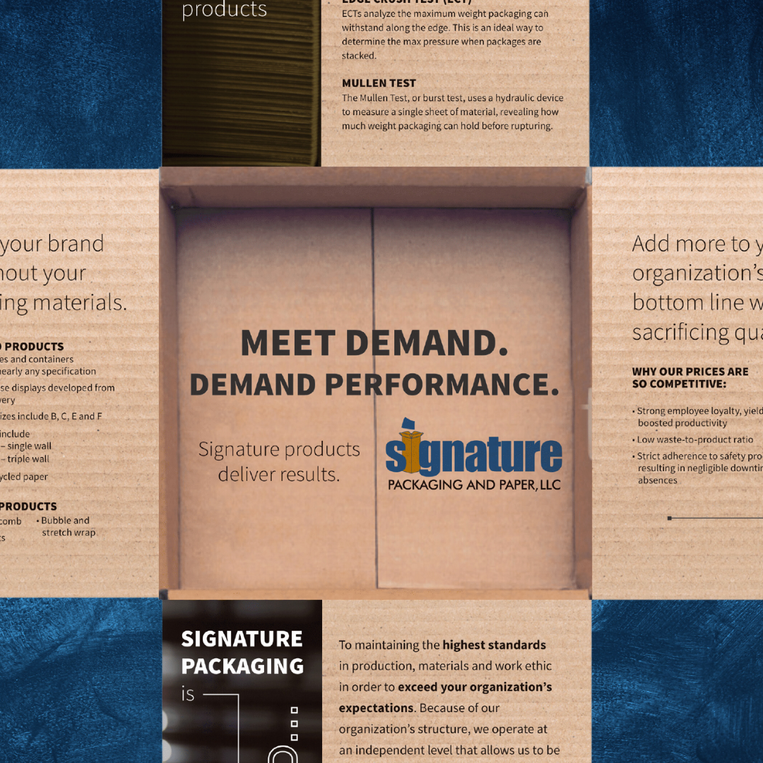
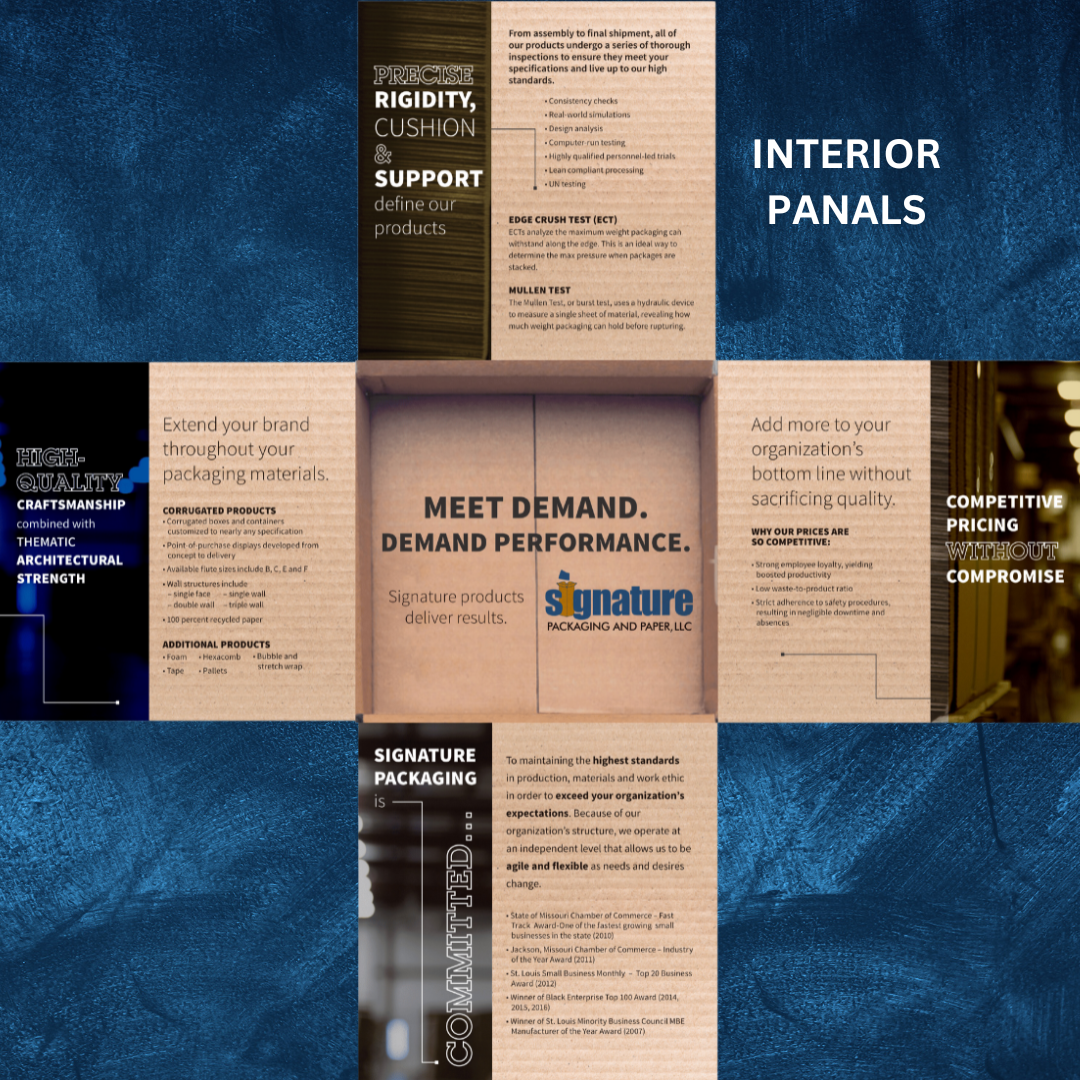
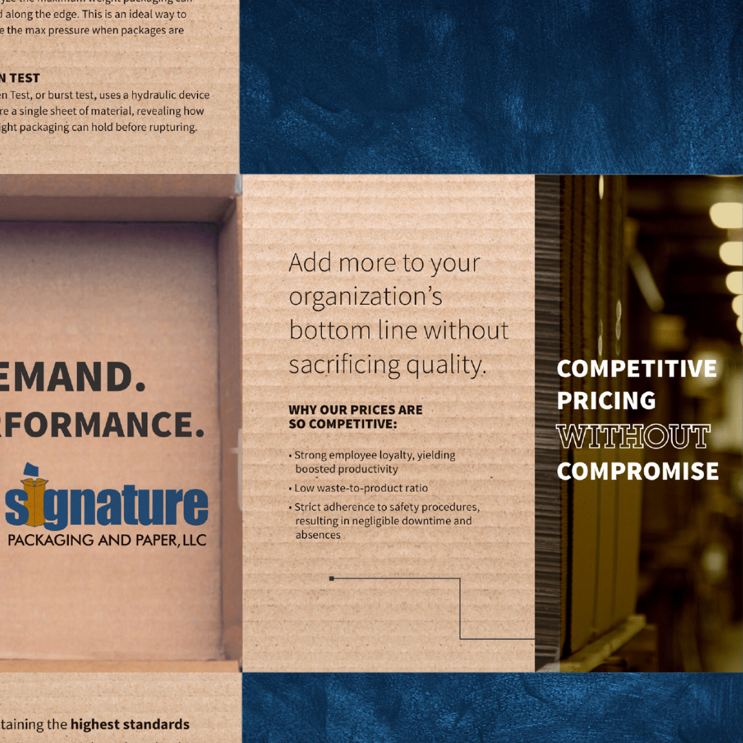
After comparing form factors, I landed on a square brochure shape. After writing the copy, I directed the designer to use cardboard textures and the interior photo of a box in the visual layout. My objective was to make it feel like you were opening a box as you engaged with the brochure. As someone went through the brochure, they were essentially unboxing Signature’s values and USPs.
Results
Since the brochure was an odd size compared to other brochures, it stuck out in piles of collateral and helped to create premium, deluxe-feeling mailings. Click an image to enlarge it.