Role:
Content Director and Copywriter
Page Contents
The Problem
Stitch It, a machinery company focused on embroidery machines, had a great offer for prospective business owners, but due to their outdated website and limited team, they were having trouble reaching their target market. Their website was not approachable for people outside of the industry, so any marketing efforts focused attracting and nurturing new business owners fell flat.
Scope of work
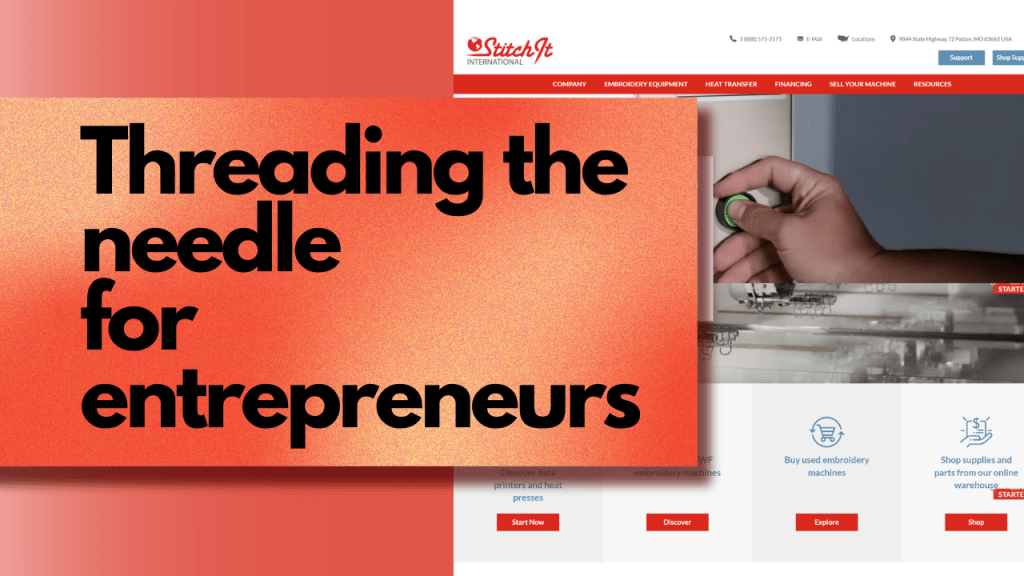
Threading the Needle for New Entrepreneurs
As the content director at BOLD Marketing, I was fully involved in most aspects of the Stitch It campaign, leading a multi-pronged approach.
- Website redesign and content creation
- Curated squeeze webpage
- Display ads
- Regional radio
- Paid search
- Video
While I helped direct and over see video and graphic design, I am not the graphic designer behind this work.

Campaign Theme: Power Up
Since we were launching so many deliverables, unifying the message and brands across different pieces was a priority. I started with Power Up Profits, but this extended to Power Up Production, and Power Up People. Each of these statements speak to the capabilities of the machines Stitch It sells.
- Power Up Profits: with the right niche, embroidered pieces deliver 8x-10x their price
- Power Up Production: machines can embroider 6-8 pieces at the same time.
- Power Up People: machines are easy to learn and Stitch It offers resources and classes so operators are never alone to maintain them.
I used the this messaging and icon branding throughout deliverables, including onboarding packets handed out at trade shows.
Customer Testimonial Video
Much to my benefit, the customers of Stitch It were thrilled to talk about why they enjoyed working with the company so much.
I oversaw the production of several Stitch It videos, which included storyboarding, scripting, writing and asking interview subjects questions, and helping with filming and framing.
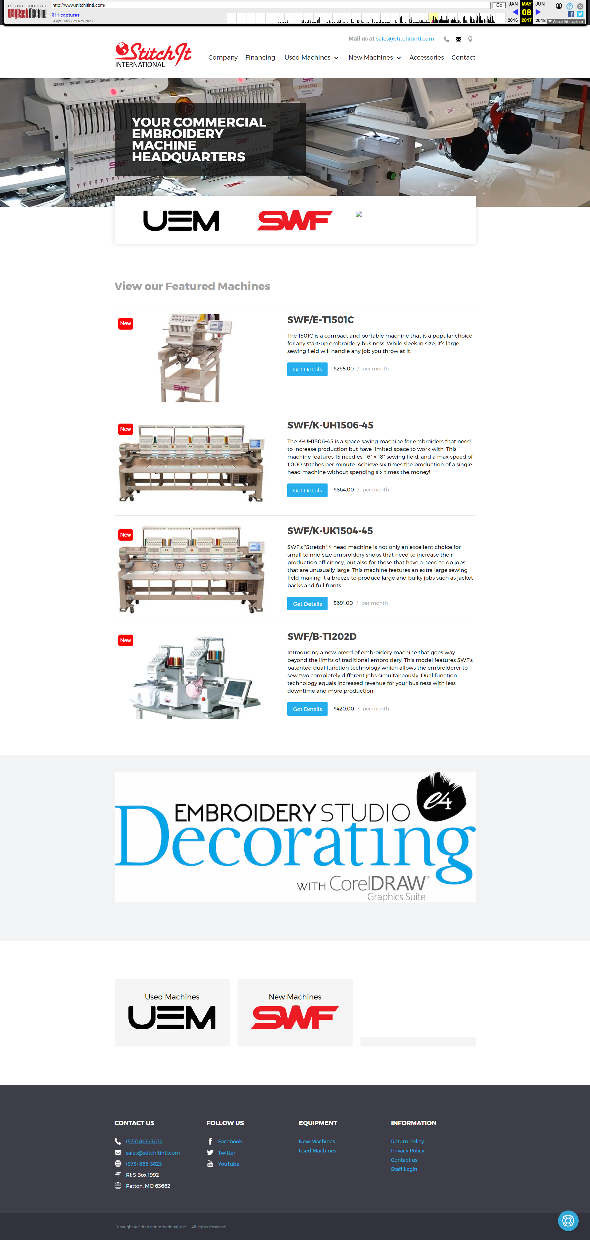
Website Redesign and Rewrite Rational
The original Stitch It website lacked key sections that would lead prospects through the sales funnel. The new website redesign offered the opportunity to shake up content and help customers through the purchase process, no matter their business or embroidery experience. For the web redesign, I wireframed and outlined most pages. For the sake of brevity, I’ll focus on only the homepage here:
Welcoming Current and New Customers
I made the decision to sacrifice some SEO in the header in order to speak more broadly to business owners. Instead of positioning Stitch It as an embroidery machine company, I used language that lauded their customer-relationship values, reinforcing that further with on-page testimonials and reviews. We still hit embroidery keyword phrases elsewhere on the site.
Making Common Pages Easier to Find
Based on customer communication and Google analytics, I could see which pages were popular and the difficult flow users had to take to find what they were looking for. To make navigation simpler for returning customers, I worked with the developer to create links right under the hero image that quickly took return visitors to common pages. Secondly, this section allowed me to subtly promote Stitch It’s new heat transfer machines.
Removing Choice Paralysis
Instead of finding a list of potential machines to purchase right away, I stripped away the possibility of users feeling overwhelmed by featuring the most popular machine among new users.
Adding Credibility
Prior to the redesign, capturing leads from out of state proved difficult. The previous website lacked reviews, testimonials, and recognizable brand partners. To help users overcome apprehension, I advocated for the placement of all three throughout the homepage.
Supporting Business Owners
Starting a business is no small ask. To help users feel confident in their decision and to help them find success, I listed out many of the resources Stitch It offered as part of their commitment to providing classes, readings, and videos for an audience with a range of expertise. I wanted customers to know they weren’t alone with their new investment.
Website Before and After Comparison
Slide the middle bar to the left and right to compare the difference.